What does it mean to have a mobile-first website?

Mobile-first indexing

We know the rise of smart phones has greatly increased the number of mobile visitors on many websites, with small screen devices outnumbering desktop visits for lots of website owners. You may have even heard of the term “mobile-first” when it comes to designing your website, focusing on providing a great user experience on a … Read more

Marketing your business online in 2012 – how was it for you?

Marketing in 2021

Let’s take a quick look back at 2012 and a brief glimpse into 2013 – how have you been marketing your business online and has it been successful?

Responsive Web Design – a non techie overview

Responsive Web Design

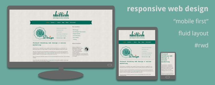
At Skittish, we encourage clients to opt for a responsive website. But what do we mean by this? Well, in layman’s terms it’s a site with a fluid layout which responds and changes depending on the width of the screen and the device that’s displaying it. So the width of the content fits the width of the device and eliminates the need to continually zoom in when using small screens.