
Responsive Web Design – a non techie overview
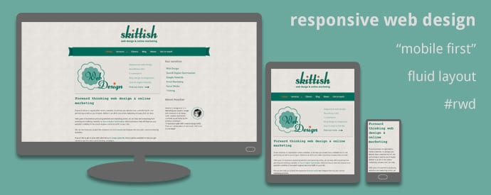
At Skittish, we encourage clients to opt for a responsive website. But what do we mean by this? Well, in layman’s terms it’s a site with a fluid layout which responds and changes depending on the width of the screen and the device that’s displaying it. So the width of the content fits the width of the device and eliminates the need to continually zoom in when using small screens.