
Images are an important aspect of website design strategy, from professional product photography to really showcase your products to headshots and group shots to show your team in their best light. With fantastic imagery, you can make a mediocre website look fantastic and, likewise, with poor photography, you can make a fantastic website look unprofessional and low-budget. So, getting your website imagery right, is a vital part of your website redesign and not something you should think of as just a “nice to have”.
With landing pages, your goal is to convert as much of the traffic they receive into leads or sales, so images become even more important as we only have a split second to form that first impression with a new visitor. You want the image to catch their eye, but not distract them from your call to action.
So, what’s the best strategy for images on your landing pages? Surely it’s going to be a picture of your product or someone using your service? In some cases that can work well. The image tells the user exactly what it is you are selling and they can assess whether that’s the right product or service for them.
Some examples of landing pages that use this strategy:
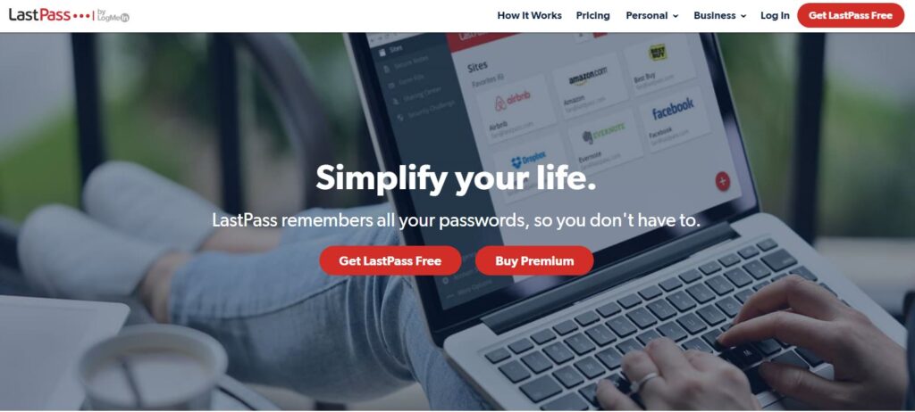
LastPass uses an image of a customer using their service

MailChimp uses a more abstract illustration
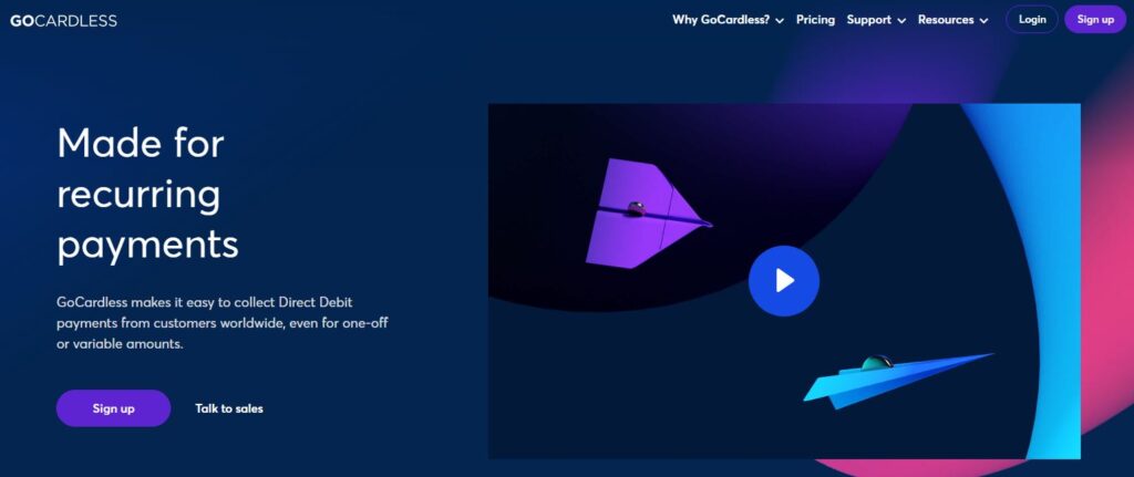
GoCardless uses a product explainer video
Whilst this may work for some, it’s not always the best way to engage with customers. You’re essentially “talking” about yourself and your product with little effort to relate that to what your customer needs.
Psychologists know that purchases are often an emotional act, so what if we can engage with our customers on an emotional level through the images we use on our landing pages? We could, in theory, increase our conversion rates, simply by rethinking our imagery.
Take this example from a real estate agency:
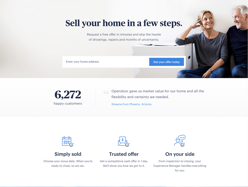
They could have gone with an image of a house with a “SOLD!” sign out front, but instead they focused on the emotional aspects of selling a property, featuring a relieved couple, relaxed and smiling post-sale. They could have got this really wrong and focused on the negative emotions, the stresses, worry and often sheer panic involved in moving house, but that’s not what customer wants to buy. They want to buy what that couple have; peace of mind that their house sale will go smoothly.
As humans we’re pre-programmed to recognise faces (even when an object doesn’t technically have one!) and so images containing a face capture our attention more and help us connect with the content.
Interestingly, in the below example which utilises eye-tracking software, there’s a definite fixation on the baby’s face as it has eye contact with the viewer.
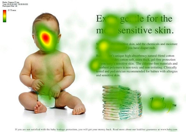
When the baby’s gaze is turned towards the text and the call-to-action, we see the user’s gaze do the same.
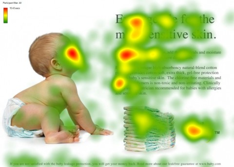
So if you’re looking to get the user’s attention before guiding them through to the call-to-action on your landing page, using an image of a person or face where their gaze is directed at the CTA could improve your chances of them submitting their details or clicking through to the next step.
Of course, this isn’t going to be appropriate for every business or every landing page, but there are a few tips to consider, whatever you’re promoting:
- Avoid stock images of people – it’s really obvious they are stock images and not representative of your company or your team (especially when you see the same person on multiple websites!)
- Focus on your customer and what they need to achieve or what pains they need to relieve (and how your product does that). Think positive outcome!
- Think about where your customer is in their buying cycle. Are they just researching possible solutions or are they ready to buy? This could influence how you communicate with them in both your written and visual messages.
Whilst there are many guides on how to create the best landing pages, much of what we know comes from research and trialling different landing page images, layouts and copy. This will likely be the same for your business, so be open to changing your images and tracking which version of your landing page converts the most traffic.