
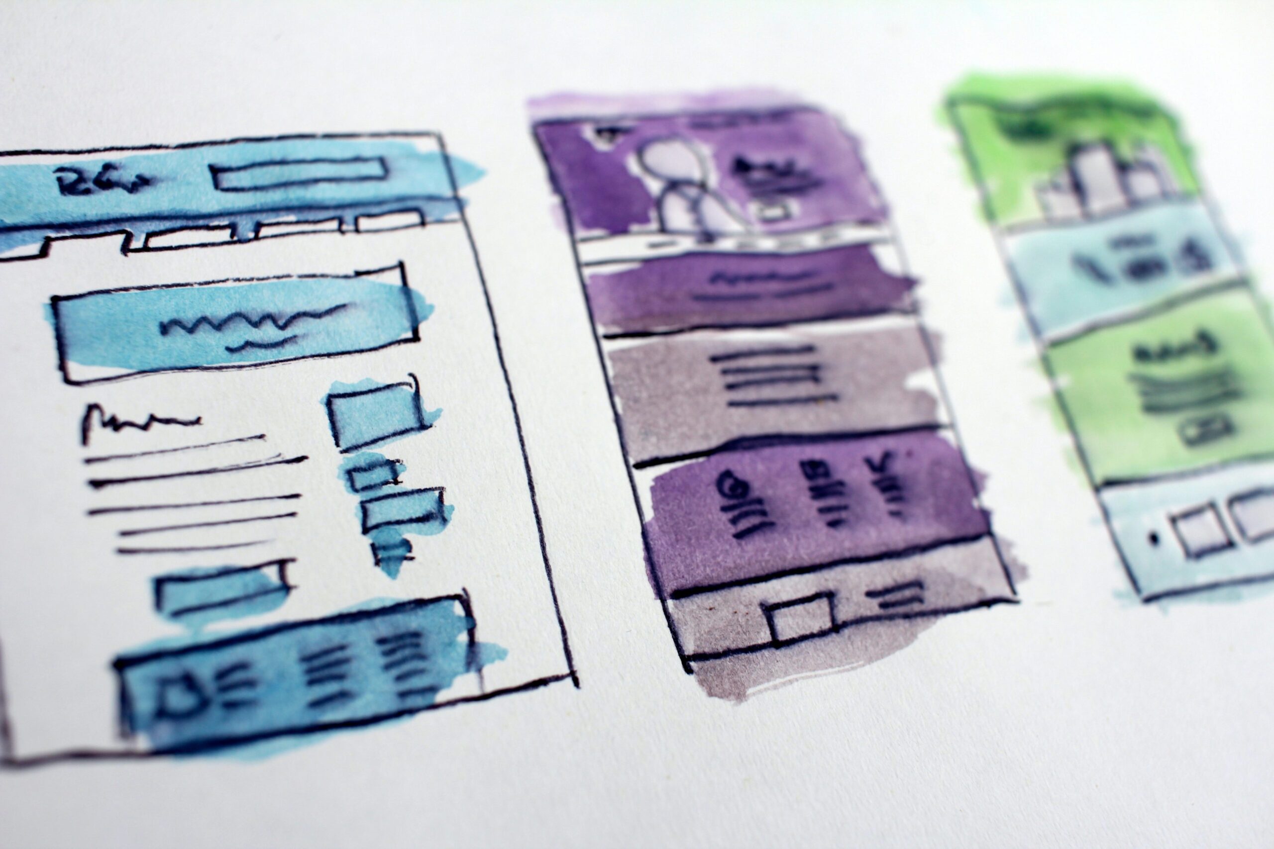
It’s the million dollar question that we’d all like the answer to, but there are so many factors involved, it can be difficult to figure out why some websites and landing pages perform better than others at generating sales and leads.
Here’s some of the main factors and issues we come across with landing pages:
#1 Poor usability
When you’re just making it plain difficult for your website visitors to engage with you and your content. When you’re hiding key information from them in layers and layers of navigation, making them download it in PDF format (no-one wants to do that on a mobile phone, FFS! Just display the info on a web page. Sure it takes more work , but don’t make your website visitors do the work for you, because they won’t. Believe me.).
Usability is soooo underrated and often forgotten about when building a website and landing page as we’re too preoccupied with how it’s going to look, whether it’s more modern and slick than the competitor’s and whether Geoff from accounts looks creepy in the team photo. Users don’t care about any of this, they just want to know how to do business with you.
#2 No call-to-action
We can often get distracted by the content we want on our site, making sure each page has enough information to convince our audience we’re the right company to do business with. There’s nothing wrong with that, but then we forget the biggie! The CTA (or call-to-action).
Once we’re done convincing, we need to get them to take action. What do you want them to do? Call you? Submit a form for a quote or book an appointment? Add a product to a shopping cart? Tell them! Never assume they’ll know what to do next or how to do it.
If you’ve got a long page of content, don’t make them scroll back to the top to take action, provide a CTA at the bottom too. Make it easy for your visitors.
#3 Overly cluttered or distracting content
Keep it simple, stupid. You’ve heard it before and it applies to your websites and landing pages too. If the main goal of your landing page is to get people to download a whitepaper, for example, make sure this is clear at the top of the page with a data capture form alongside a simple headline and image.
List a few key benefits for the user, but don’t write war and peace about how many years experience you’ve had or the endless awards you’ve won. Don’t confuse your users with additional promotions or links to your social media channels. We have one goal (to get them to download your whitepaper) and if your content isn’t pushing people towards that goal, it’s taking them away from it. So keep it focused.
Conclusion
There’s lots you can do to improve your landing pages and their conversion rates and it’s a case of experimentation, making changes and running split tests to see which performs better and which resonates with your audience. The landing that converts the best might not be your favourite design and that’s ok. It’s not for you, remember, it’s for your customers.
Leave a Reply